CGI x SMU DataJam 2026

The Data Analyst's Dilemma:
Scientist. Artist. Author.

A 2-hour workshop on moving beyond "making charts" to building narratives that drive decisions.

Presenter: Rose Boudreau — AI Systems Architect at CGI & NSCC Data Analytics Student

🔬

The Scientist

Rigorous data hygiene. Checking bias. Questioning “obvious” correlations and digging deeper than the easy narrative.

🎨

The Artist

Color theory, Gestalt principles, visual hierarchy. Reducing cognitive load so the data speaks clearly.

📝

The Author

Headlines, not labels. Crafting narratives from data that guide the audience to conclusions with integrity.

Workshop Agenda

2 hours. 4 acts. Two streams: Flourish (drag-and-drop) & Python (code). Choose your path.

0:00 – 0:15

Act 1: The Hook

The Trap — correlation vs. causation with real macro-economic data.

0:15 – 0:45

Act 2: The Scientist

Dig deeper. Build scatter plots. Question every correlation. Find your own data.

0:45 – 1:15

Act 3: The Artist

Good vs. bad visualization. Color theory. Chart selection. Design principles.

1:15 – 2:00

Act 4: The Author

The Sandpit — tell three contradictory stories from the same dataset.

Download the Datasets

The Hook: The Trap

We show you a chart. You’ll draw a conclusion. And you’ll be wrong. That’s the point.

Jobs vs ChatGPT - The Misleading Chart
🚩 The Trap

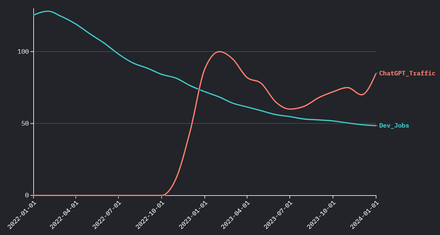
Dev Jobs vs. ChatGPT Traffic

As ChatGPT usage rises, dev job postings plummet. Obvious conclusion: “AI is killing jobs.” But is it?

Jobs vs Interest Rates - The Truth
✅ The Truth

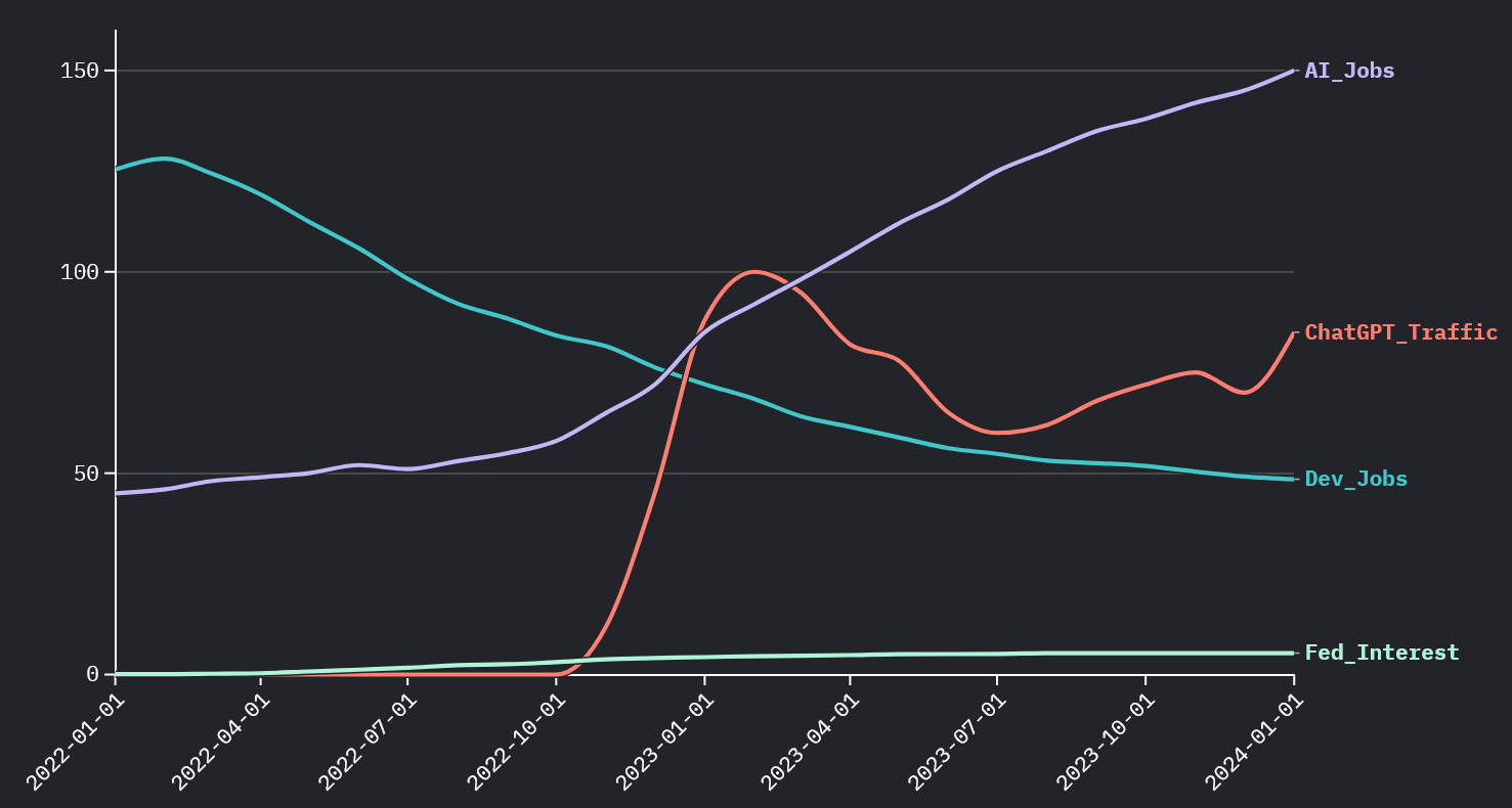
Dev Jobs vs. Federal Interest Rate

The real driver: as interest rates climbed from 0% to 5.3%, venture capital dried up and hiring froze. Timing ≠ causation.

💡 The Lesson

ChatGPT launched in November 2022 — the exact same period rates spiked. Two things happened simultaneously, but only one caused the hiring freeze. The Scientist asks: “What’s the mechanism?”

Interest rates ↑ → Venture capital dries up → Startups freeze hiring → Big Tech follows with layoffs. ChatGPT? Coincidence, not causation.

1Recreate “The Trap” in Flourish

Open Flourish: Go to flourish.studio and create a new “Line chart” visualization.
Upload Data: Import tech_hiring_macro_trends.csv. Set Date as X-axis.
Configure Series: Add Dev_Jobs as the first line (red, solid). Add ChatGPT_Traffic as a second line (green, dashed). Use a secondary Y-axis for ChatGPT.
Title It Like a Headline: Use “Did AI Kill the Entry-Level Job?” — not “Line Chart of Data.”
Now Swap It: Remove ChatGPT_Traffic. Add Fed_Interest instead (blue, dotted). Watch the narrative flip entirely.

1Recreate “The Trap” in Python

Copy-paste this into a Jupyter notebook or Python file. Requires pandas, plotly.

import pandas as pd
import plotly.graph_objects as go
from plotly.subplots import make_subplots

df = pd.read_csv("data/tech_hiring_macro_trends.csv", parse_dates=["Date"])

# THE TRAP: Dev Jobs vs ChatGPT
fig = make_subplots(specs=[[{"secondary_y": True}]])
fig.add_trace(go.Scatter(x=df["Date"], y=df["Dev_Jobs"],
    name="Dev Job Postings", line=dict(color="#ef4444", width=3)), secondary_y=False)
fig.add_trace(go.Scatter(x=df["Date"], y=df["ChatGPT_Traffic"],
    name="ChatGPT Interest", line=dict(color="#22c55e", width=3, dash="dash")), secondary_y=True)
fig.update_layout(title="The Trap: Did AI Kill the Entry-Level Job?",
    template="plotly_dark", paper_bgcolor="#0f172a", plot_bgcolor="#0f172a",
    hovermode="x unified", legend=dict(orientation="h", y=-0.15))
fig.show()
# THE TRUTH: Dev Jobs vs Interest Rate
fig2 = make_subplots(specs=[[{"secondary_y": True}]])
fig2.add_trace(go.Scatter(x=df["Date"], y=df["Dev_Jobs"],
    name="Dev Job Postings", line=dict(color="#ef4444", width=3)), secondary_y=False)
fig2.add_trace(go.Scatter(x=df["Date"], y=df["Fed_Interest"],
    name="Fed Interest Rate (%)", line=dict(color="#3b82f6", width=3, dash="dot")), secondary_y=True)
fig2.update_layout(title="The Truth: Interest Rates Drove the Hiring Freeze",
    template="plotly_dark", paper_bgcolor="#0f172a", plot_bgcolor="#0f172a",
    hovermode="x unified", legend=dict(orientation="h", y=-0.15))
fig2.show()

The Scientist: Correlation ≠ Causation

Data-driven narratives are not black and white. Good Data Analysts provide nuance, not clickbait.

Dataset Preview: tech_hiring_macro_trends.csv

DateDev_JobsChatGPT_TrafficFed_InterestAI_Jobs
2022-01125.400.0845
2022-1181.5123.7865
2023-0268.41004.5792
2024-0148.5855.33150

Key observation: Dev jobs dropped 61% while AI jobs grew 233%. ChatGPT traffic AND interest rates both correlate — but which one has a causal mechanism?

1Build a Scatter Plot in Flourish

New Viz: In Flourish, choose “Scatter plot”.
X-axis: Set to ChatGPT_Traffic. Y-axis: Dev_Jobs. Add a trendline.
Observe: You’ll see a strong negative correlation. Title it: “ChatGPT vs Dev Jobs — Looks Scary, Right?”

2Now Build the Counter-Narrative

Duplicate the viz. Change X-axis to Fed_Interest. Title: “The Real Driver: Interest Rates.”
Compare: Both correlate strongly — but only one has a causal economic mechanism.

3Bonus: AI Jobs vs Dev Jobs

Create a third scatter: X = AI_Jobs, Y = Dev_Jobs. This shows the workforce is shifting, not shrinking.

🎯 Activity Time!

Basic Stream

Visualize the dataset using any Flourish chart type of your choosing. Embed your narrative within the title and description.

Advanced Stream

Find additional data using AI or Google (e.g., VC funding data, NASDAQ index, layoff trackers) from a reputable source. Add it to alter your narrative and show a more complete picture.

1Scatter Plots with Trendlines

import pandas as pd
import plotly.express as px

df = pd.read_csv("data/tech_hiring_macro_trends.csv", parse_dates=["Date"])

# Scatter 1: ChatGPT vs Dev Jobs (the misleading correlation)
df_chat = df[df["ChatGPT_Traffic"] > 0]
fig1 = px.scatter(df_chat, x="ChatGPT_Traffic", y="Dev_Jobs", trendline="ols",
    title="Dev Jobs vs ChatGPT Traffic — Looks Scary, Right?",
    labels={"ChatGPT_Traffic":"ChatGPT Search Interest", "Dev_Jobs":"Dev Jobs (Index)"},
    color_discrete_sequence=["#ef4444"], template="plotly_dark")
fig1.update_layout(paper_bgcolor="#0f172a", plot_bgcolor="#0f172a")
fig1.show()

# Scatter 2: Interest Rate vs Dev Jobs (the real driver)
fig2 = px.scatter(df, x="Fed_Interest", y="Dev_Jobs", trendline="ols",
    title="Dev Jobs vs Federal Interest Rate — The Real Driver",
    labels={"Fed_Interest":"Fed Rate (%)", "Dev_Jobs":"Dev Jobs (Index)"},
    color_discrete_sequence=["#3b82f6"], template="plotly_dark")
fig2.update_layout(paper_bgcolor="#0f172a", plot_bgcolor="#0f172a")
fig2.show()

2Correlation Heatmap

import plotly.graph_objects as go

corr = df[["Dev_Jobs","ChatGPT_Traffic","Fed_Interest","AI_Jobs"]].corr()
fig = go.Figure(data=go.Heatmap(z=corr.values, x=corr.columns, y=corr.columns,
    colorscale="RdBu", zmid=0, text=corr.values.round(2), texttemplate="%{text}"))
fig.update_layout(title="Correlation Matrix — Everything Correlates, But Why?",
    template="plotly_dark", paper_bgcolor="#0f172a", plot_bgcolor="#0f172a",
    width=600, height=500)
fig.show()

🎯 Activity Time!

Basic Stream

Run the scatter plots above. Which correlation looks “stronger”? Does strength of correlation prove causation?

Advanced Stream

Use pandas_datareader or find a CSV of VC funding data to add a third variable. Does it strengthen the interest rate narrative?

The Artist: Visual Hierarchy

The right chart, the right color, the right focus. Design choices are editorial choices.

❌ Bad Visualization

  • Rainbow pie chart with 22 slices
  • Title: “GDP Data” (meaningless)
  • 3D effects and drop shadows
  • Gridlines everywhere
  • Legend with 22 items off to the side
  • No hierarchy — everything screams equally

✔ Good Visualization

  • Horizontal bar chart, sorted by value
  • Title: “Switzerland Leads in GDP Per Capita”
  • One accent color for the key insight
  • Minimal gridlines, no chart junk
  • Direct labels, no separate legend needed
  • The eye goes to the story immediately
GDP vs Happiness Bubble Chart Example

Example: A well-designed bubble chart showing GDP vs Happiness with Internet Penetration as bubble size.

🎨 The Artist’s 5 Principles

1. Chart Type = Data Type: Bar for ranking. Scatter for relationships. Map for geography. Line for time series. Never use pie charts for more than 3 slices.
2. Color is Data: Use color to encode meaning (red=bad, green=good), not decoration. One accent color to spotlight the story.
3. Title is a Headline: “Nigeria’s 33% Unemployment Dwarfs Global Peers” > “Unemployment Rate by Country.”
4. Reduce Clutter: Remove gridlines, borders, 3D effects, and legends if direct labels work better.
5. Size Encodes Data: Bubble size adds a third dimension without adding complexity. Use it for population, GDP, or any magnitude.

1Bubble Chart: Happiness vs GDP

New Viz: Choose “Scatter” in Flourish. Upload global_development_2024.csv.
X-axis: GDP_Per_Capita_USD. Y-axis: Happiness_Score_0_10. Size: Internet_Usage_Pct. Color: Region.
Title: “Does Money Buy Happiness? (Bubble Size = Internet Penetration)”
Artist Touch: Use a muted palette for most regions, with one bright color for the focus region.

2Bar Chart with Accent Color

New Viz: Choose “Bar chart” (horizontal). Y = Country, X = Unemployment_Rate. Sort descending.
Spotlight Technique: Make all bars grey (#334155). Then manually color countries above 10% in red (#e31937). This draws the eye to the crisis.
Title: “Unemployment Crisis: Nigeria, Afghanistan & Costa Rica Above 10%”

3Map: CO2 Emissions

New Viz: Choose “Projection map”. Region: Country. Color: CO2_Emissions_Per_Capita.
Color Scale: Use Yellow → Orange → Red (sequential) for intensity.
Title: “CO2 Per Capita: North America Leads (Not a Good Thing)”

🎯 Activity: Create a Beautiful Visualization

Basic Stream

Choose ANY chart type in Flourish. Use global_development_2024.csv. Apply at least 3 of the 5 Artist’s Principles above. Make it beautiful AND meaningful.

1Bubble Chart: Happiness vs GDP

import pandas as pd
import plotly.express as px

df = pd.read_csv("data/global_development_2024.csv")

fig = px.scatter(df, x="GDP_Per_Capita_USD", y="Happiness_Score_0_10",
    size="Internet_Usage_Pct", color="Region", hover_name="Country",
    title="Does Money Buy Happiness? (Bubble = Internet Penetration)",
    labels={"GDP_Per_Capita_USD":"GDP Per Capita (USD)",
            "Happiness_Score_0_10":"Happiness (0-10)"},
    size_max=40,
    color_discrete_map={"Europe":"#3b82f6","Asia":"#f97316",
        "North America":"#e31937","South America":"#22c55e",
        "Africa":"#eab308","Oceania":"#a855f7"},
    template="plotly_dark")
fig.update_layout(paper_bgcolor="#0f172a", plot_bgcolor="#0f172a")
fig.show()

2Bar Chart with Spotlight Technique

import plotly.graph_objects as go

df_u = df.sort_values("Unemployment_Rate", ascending=False)
colors = ["#e31937" if r > 10 else "#334155" for r in df_u["Unemployment_Rate"]]

fig = go.Figure(go.Bar(x=df_u["Country"], y=df_u["Unemployment_Rate"],
    marker_color=colors, text=df_u["Unemployment_Rate"].round(1),
    textposition="outside"))
fig.update_layout(
    title="Unemployment Crisis: Nigeria, Afghanistan & Costa Rica Above 10%",
    template="plotly_dark", paper_bgcolor="#0f172a", plot_bgcolor="#0f172a",
    yaxis_title="Unemployment Rate (%)",
    xaxis=dict(tickangle=-45, tickfont=dict(size=10)))
fig.show()

3Choropleth Map

fig = px.choropleth(df, locations="Country", locationmode="country names",
    color="CO2_Emissions_Per_Capita", hover_name="Country",
    color_continuous_scale="YlOrRd",
    title="CO2 Per Capita: North America Leads (Not a Good Thing)",
    labels={"CO2_Emissions_Per_Capita":"CO2 (tonnes)"},
    template="plotly_dark")
fig.update_layout(paper_bgcolor="#0f172a",
    geo=dict(bgcolor="#0f172a", lakecolor="#0f172a"))
fig.show()

🎯 Activity: Create a Beautiful Visualization

Advanced Stream

Using plotly, create a visualization from global_development_2024.csv that applies at least 3 of the 5 Artist’s Principles. Add annotations, custom colors, and a narrative title.

The Author: The Sandpit

Same dataset. Three contradictory — yet truthful — stories. The Author chooses which truth to amplify.

DEI Gender Pay Gap Visualization Example

Example: A grouped bar chart revealing gender pay disparities across departments — the same data, framed by the Author.

📢 Story 1: The RTO Advocate
“Office Workers Get Promoted — Remote Workers Don’t. Period.”
Method: Group by Work_Setup, calculate promotion rate. On-Site shows ~67% vs Remote 0%. Hybrid sits at ~38%.
What’s hidden: On-site workers log 50+ hours with high visibility. Tenure, department, hours worked, and visibility bias are all ignored.
⚠️ Story 2: The Union Rep
“High Performers Working 50+ Hours Are Burning Out”
Method: Scatter plot Hours vs Mental Health, colored by Productivity. The “burnout zone” (50+ hrs, MH < 5) contains 11 employees — all scoring 85+ in productivity.
What’s hidden: Many 40-hour workers also report great mental health. Selection bias in who “burns out.”
🔍 Story 3: The DEI Auditor
“Gender Pay Gaps Persist Across Departments”
Method: Grouped bar chart of avg Salary by Department × Gender. Sales shows Male $121K vs Female $94K — a $27K gap. Engineering: Male $141K vs Female $123K.
What’s hidden: Tenure and seniority differences, sample sizes vary widely (e.g., Non-Binary n=1 in Marketing), and on-site males dominate senior roles.

💡 The Author’s Power

None of these stories are lies. But none tell the whole truth. A great Data Professional presents the nuance — not just the narrative that serves their agenda. Your job is to be honest about what the data shows AND what it doesn’t.

1Story 1: RTO Advocate (Bar Chart)

Upload workforce_dynamics.csv to Flourish.
Method: You’ll need to pre-calculate or use Flourish’s “Data” tab to count promotions by Work_Setup. Create a simple bar chart.
Color: On-Site = Red (hot/important), Hybrid = Orange, Remote = Grey (de-emphasized).
Title: “On-Site Workers Are Promoted at Higher Rates”

2Story 2: Union Rep (Scatter)

Chart Type: Scatter. X = Weekly_Hours, Y = Mental_Health_Index. Color by Productivity_Score.
Focus: Draw attention to the top-right quadrant — high hours, low mental health. Use annotations if Flourish supports them.
Title: “High Performers Working 50+ Hours Are Burning Out”

3Story 3: DEI Auditor (Grouped Bar)

Chart Type: Grouped bar chart. X = Department, Y = Salary (average). Color = Gender.
Color Map: Male = Blue, Female = Red, Non-Binary = Purple.
Title: “Gender Pay Gaps Persist in Non-Tech Roles”

🏆 Final Challenge

Basic Stream

Pick ONE of the three personas above. Build the visualization in Flourish that tells their story. Then write a 2-sentence description that a manager would read and act on. Bonus: Can you add a disclaimer about what the data does NOT show?

1Story 1: RTO Advocate

import pandas as pd
import plotly.graph_objects as go

df = pd.read_csv("data/workforce_dynamics.csv")

promo = df.groupby("Work_Setup").agg(
    total=("Promoted_Last_Year","count"),
    promoted=("Promoted_Last_Year", lambda x: (x=="Yes").sum())
).reset_index()
promo["Rate"] = (promo["promoted"]/promo["total"]*100).round(1)

fig = go.Figure(go.Bar(x=promo["Work_Setup"], y=promo["Rate"],
    marker_color=["#e31937","#f97316","#334155"],
    text=[f"{v}%" for v in promo["Rate"]], textposition="outside"))
fig.update_layout(title="RTO Advocate: On-Site Workers Get Promoted More",
    template="plotly_dark", paper_bgcolor="#0f172a", plot_bgcolor="#0f172a",
    yaxis_title="Promotion Rate (%)", yaxis=dict(range=[0,80]))
fig.show()

2Story 2: Union Rep

import plotly.express as px

fig = px.scatter(df, x="Weekly_Hours", y="Mental_Health_Index",
    color="Productivity_Score", size="Salary", hover_name="Emp_ID",
    title="Union Rep: High Performers Are Burning Out",
    color_continuous_scale="RdYlGn", template="plotly_dark")
fig.update_layout(paper_bgcolor="#0f172a", plot_bgcolor="#0f172a")
fig.add_shape(type="rect", x0=50, x1=66, y0=0, y1=5,
    fillcolor="rgba(239,68,68,0.1)", line=dict(color="#ef4444",dash="dash"))
fig.add_annotation(x=58, y=2.5, text="BURNOUT ZONE",
    font=dict(color="#ef4444",size=12), showarrow=False)
fig.show()

3Story 3: DEI Auditor

pay = df.groupby(["Department","Gender"])["Salary"].mean().reset_index()

fig = px.bar(pay, x="Department", y="Salary", color="Gender", barmode="group",
    title="DEI Auditor: Gender Pay Gaps Persist Across Departments",
    color_discrete_map={"Male":"#3b82f6","Female":"#e31937","Non-Binary":"#a855f7"},
    template="plotly_dark")
fig.update_layout(paper_bgcolor="#0f172a", plot_bgcolor="#0f172a",
    legend=dict(orientation="h", y=-0.15))
fig.show()

🏆 Final Challenge

Advanced Stream

Pick ONE persona. Build the chart in Python. Then modify it to tell the opposite story from the same data. Add annotations explaining what the original chart hid. This is the Author’s superpower: showing both sides.

Resources & Next Steps

Everything you need to continue your data storytelling journey.

📥 Datasets

All datasets are available for download above, or directly from the repo:

  • data/tech_hiring_macro_trends.csv
  • data/global_development_2024.csv
  • data/workforce_dynamics.csv

🛠️ Tools

📚 Further Reading

🐍 Python Quick Setup (for Advanced Stream)

# Install required packages
pip install pandas plotly jupyter statsmodels

# Start Jupyter Notebook
jupyter notebook

# Or run scripts directly
python pythonSolutions/act1_the_hook.py
python pythonSolutions/act2_the_scientist.py
python pythonSolutions/act3_the_artist.py
python pythonSolutions/act4_the_author.py

🔮 Workshop Recap: The Data Analyst's Dilemma

🔬 The Scientist

Question every correlation. Look for mechanisms, confounders, and hidden variables. Correlation ≠ causation.

🎨 The Artist

Choose chart types wisely. Use color with purpose. Write headlines, not labels. Reduce clutter ruthlessly.

📝 The Author

Data tells many stories. Choose yours ethically. Show what the data reveals AND what it hides.